
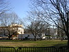
 I’ve been walking down this block most workdays for the past year, and it was only this morning that I noticed there are wind chimes hanging from many of the trees in Mount Vernon Square, on the grounds of the Carnegie building, now home to the Historical Society of Washington D.C. This set of chimes is barely audible above the ruckus of 8:45 A.M. traffic. But even so, it’s nice knowing that it’s there.
Category: Local News and Views
Some links: 41
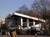
It turns out that Adolph Cluss’s handsome Franklin School, which I had noticed during a commute last spring, is the focus of some controversy, per reporting by Jonathan O’Connell. The city is seeking redevelopment partners for the site.
The school served as a homeless shelter until a year ago when [Mayor Adrian] Fenty closed it as part of his plan to restructure the city’s supportive housing services. The closure prompted protests from advocates for the homeless and Fenty did not hold a press conference to announce the solicitation as he has for other development plans.
Another one down
From Missy Frederick for the Washington Business Journal comes the unhappy news that Timberlake’s restaurant in Dupont Circle will be closing at the end of May, to reopen under a new identity. Timberlake’s was one of my favorite places to get brunch and a glass of wine before a 1:30 movie on Saturday afternoon—at least, back in the days when I could knock back a frittata without thinking about the cholesterol impact. The decor was nothing special, garden variety wooden booths and pub furnishings: the place was just dang comfortable.
Round Arch Style
Earlier this week a train malfunction led to my early exit from Metro at McPherson Square, and a fortunate exit it was, for my path took me within a block of a downtown building I’d never noticed before, at 13th and K: the Franklin School, a red brick rundbogenstil confection from 1869 designed by Adolf Cluss.
Now and there
Kent Boese has started a swell series of Then and now posts for Greater Greater Washington.
Almost two million people, seen from space
Via The Morning News, satellite imagery of the crowd(s) on the National Mall for yesterday’s ceremonies. What’s interesting about the picture is that you can see that people were clumped at the big video screens: it wasn’t the solid mass of people that it looked to be, foreshortened, from the Capitol. Also note the lack of bodies on the downhill slope west of the Monument, where the view would have obstructed.
Upcoming: 13
 Crews are assembling bleachers and building reviewing stands in the plaza that once was Pennsylvania Avenue north of the White House in preparation for the inaugural ceremonies later this month. Unfortunately, with the green accents of the cherry picker in front of it, the temporary pavilion looks like a gas station.
Crooked Koger watch: 1
Jeffrey S. Koger has pleaded guilty to charges of wire fraud and tax evasion, associated with the embezzlement of homeowners association funds that he managed. Sentencing is set for 6 February 2009. He still faces charges in connection with a shootout with police officers this past February.
The other shoe drops, and then another
Expect to read more of this bad news in the future: DCist reports that Olsson’s Books and Records has converted its bankruptcy filing to Chapter 7 and closed all of its remaining stores, while Washington City Paper’s parent company has also sought bankruptcy protection.
Mishmash
The street name signs in Fairfax City constitute the most egregious mess of colors and styles in the metropolitan area.
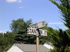
 The smaller intersections are marked with generic black on white signs, with or without block numbers. These simple, functional signs are similar to those used in Arlington County.
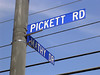
 Up on the busier thoroughfares, the signs switch to white on blue. Most use a readable but pedestrian all-caps sans serif. Overhead signs use “Freeway Gothic” in mixed case.
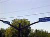
 There is a pinched condensed font that suggests credits on a movie poster. (Unfortunately, an example or two of this developer-friendly sign can be found in Reston, too.) The contrast with the white on green is particularly ugly.
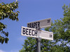
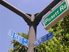
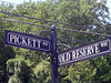
 Intersections in the old town center use signs with a scrolled border and a decorated serif, but recent traffic re-engineering is replacing these with the ordinary overheads.
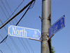
 This example, missing the street type and the block numbers, appears to be a one-off. Notice the brackets for the crossing sign for University Drive, which is missing.
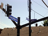
 You can even find a few examples of this jaunty mixed-case sans serif, shown here with an afterthought black and white locator.
 This blue-bronze sign for a new subdivision of starter McMansions is especially galling.
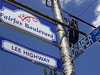
 But the worst specimens accrue to the recent dual-designation within the city of U.S. Route 50, which follows Arlington Boulevard, Lee Highway, and Main Street, as “Fairfax Boulevard.” This led to the creation of these red-white-and-blue decorative contraptions. Notice the oops-addition of a sign for Blake Lane, which was extended to this intersection about 20 years ago.
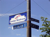
 Minor intersections were fitted with smaller versions of the ungainly, squareish Fairfax Boulevard signs.
Related: My pedantic nuthatch posts from ’05 and ’06 on street name signs in Reston, Fairfax County, Lake Barcroft, Alexandria, Arlington, Bethesda, and the District.
Some links: 26/a
The Post reprinted my complete plug for Huntley Meadows Park in the background material for its Fairfax County Community Handbook.
Aw, nuts
But not a big surprise: following the recent closure of its Penn Quarter store, local independent bookseller Olsson’s has filed for Chapter 11 bankruptcy, reports DCist and Anita Huslin. My list of favorite things in D.C. keeps getting shorter.
Mucho agua
When today’s biggest storm blew through Sterling at 3:00, the wind and rain whistling on the gravel roof of our office building sounded like someone pulling romex through a tube. DCist has a series of posts on the carnage.
Trees were down all along the Georgetown Pike corridor, so I was detoured onto Utterback Store Road and Old Dominon Drive, but once I got to the Beltway, my commute to Silver Spring was rather easy. At the Stage, we had water in the building, but not for the expected reasons. Rather, a contractor working on the sidewalk upstairs had basically punched a hole in our ceiling. Fortunately for our productivity, the water was at the other end of the suite, in the green room, so we could work while a crew cleaned up.
Back at home, a couple of my clocks were flashing 12:00, but the power cut must have been only a flicker. And most importantly, the house remains watertight. Although the overgrown tuliptree in the back, quite sodden, now looks like it wants to climb onto the roof.
More to see
Artomatic 2008 is more spacious and generally comfortable than its predecessor events, spanning nine floors of Capital Plaza I, none of them built out. It was quite pleasant to use the office tower to get a 360° look at the burgeoning neighborhood around the New York Avenue Metro station. The entire block between the station and the tower is a hole in the ground right now.
Added corporate sponsorship provided for waystations on most of the floors—a needed rest for most of us, because there is a lot to see. A surprising amount of photography (well, maybe not, digital imaging is inexpensive), almost all of it worth a look.
There were several opportunities to step into a booth for a special experience: a camera obscura, a panorama of a Norway mountaintop, a documentary video installation from Galicia in western Ukraine, a nature-themed corner from Joanna Cornell promoting the Neighborhood Ecological Stewardship Training program.
I stopped the longest for a suite of introspective, biomorphic abstractions by Gail Vollrath. I also enjoyed a flock of crows well-observed and sculpted by Janet Gohres.
Some links: 26
Marc Fisher picked up my plug for Huntley Meadows Park for the Post’s Community Handbook.